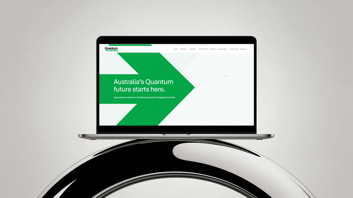
Is your navigation menu poorly structured?

Navigation menus are often treated as an afterthought - a simple list of links that “covers everything” your business offers. On launch day, it works. Visitors click. Pages load.
But as your business grows, pages expand, and ideas multiply, poorly structured menus reveal their fragility. They confuse users, create hidden operational debt and quietly reduce conversion.
Most menus fail because they try to serve every audience at once. Investors, first-time visitors, returning customers, clients - each has different goals. When all are lumped together, visitors must hunt for the link that matters to them, increasing cognitive load and frustration.
A menu isn’t just navigation. It’s infrastructure. And like any infrastructure, it needs to scale with your business.
What to look for? - Start with hierarchy
Identify primary objectives: What actions matter the most? What page supports that action?
Make secondary and tertiary links subordinate by design.
Use visual weight, placement and grouping to communicate importance.
Any link competing with the primary action is a structural flaw.
Menus also fail because they are static. As businesses grow., services expand or products multiply - the initial menu you had when you first got your website might not fit your current strategy.
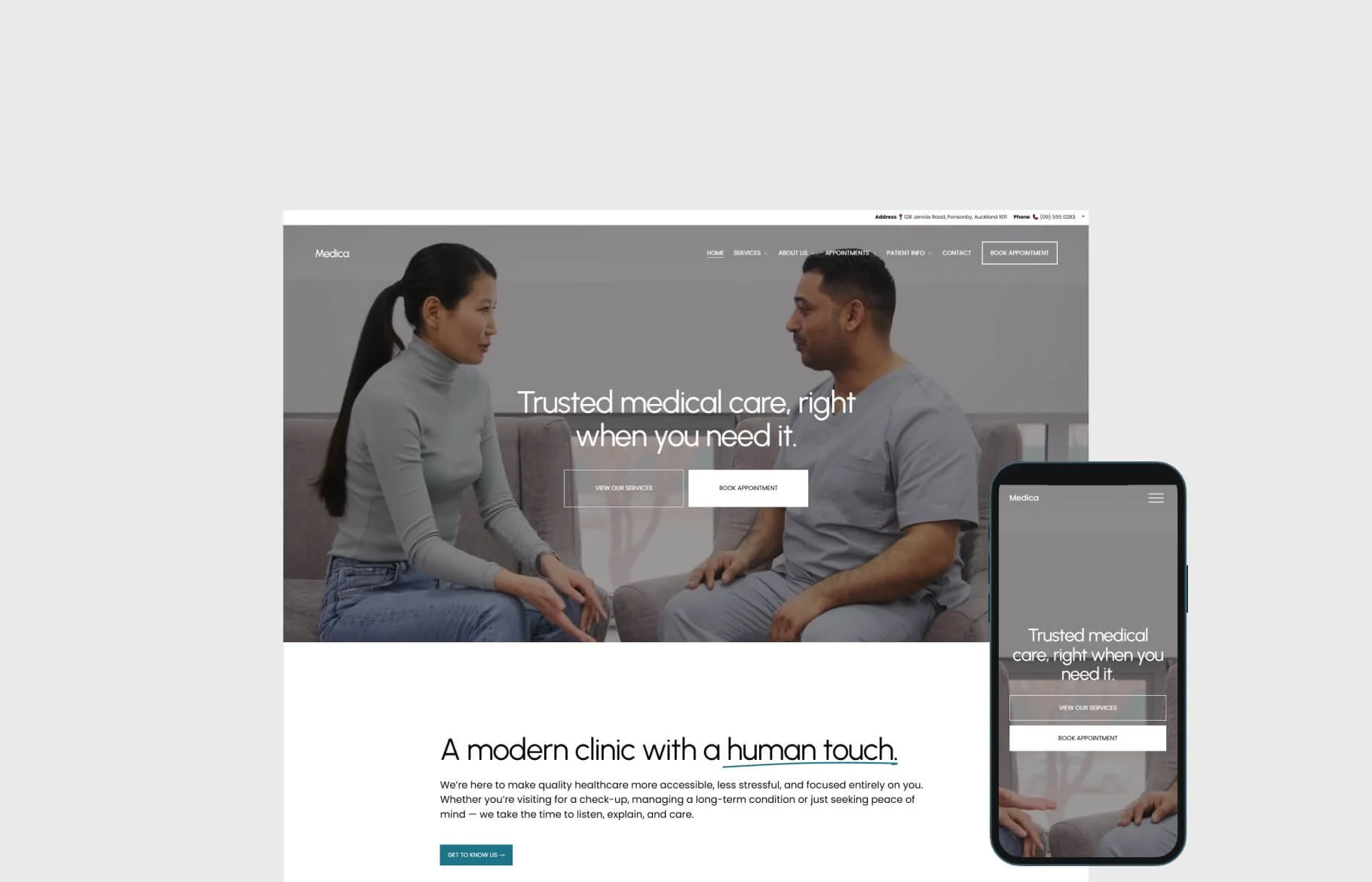
Menu labels must be unambiguous
1. Speak the user’s language
Avoid internal jargon, brand-specific terms, or cute/clever labels.
Think about how your audience would describe what they’re looking for.
Test with people outside your team if possible: would they know where to click?
Example: Instead of “Solutions & Offerings,” use “Services” or “What We Do.”
2. Be specific, not generic
Broad labels like “Resources” or “Products” can be confusing.
Narrow it down to the primary outcome or category.
Example: Instead of “Products,” use “E-commerce Stores” or “Custom Websites.”
3. Prioritise action or outcome
Menu labels should hint at what the user can achieve by clicking.
Focus on verbs or clear nouns that describe the value.
Example: “Get a Quote” is clearer than “Pricing,” if the goal is conversion.

Spacing and rhythm matter
Crowded menus feel busy and cheap. Telling someone to go EVERYWHERE is essentially telling them to go nowhere.
Dropdowns, mega menus or multi-level structures should be used deliberately, not as decoration.
Poorly structured menus increase bounce rates because users cannot find what they need.
Make it hard to navigate your website and the user will simply leave.
Rule of thumb: Menus with more than 5 links should be grouped into clear sections. Every choice should reduce friction, not add it.
Generous spacing signals clarity, restraint and confidence. The difference is subtle but perceivable, visitors may not articulate it but it shapes trust and perception as they will feel guided through your website effortlessly.
The result of poor navigation is invisible chaos. The result of a well-structured menu is calm, clarity and reliable direction. Your business growth exposes weak foundations, your website is the same. Most navigation menus work fine on launch day. Scalable menus work under pressure, guiding visitors effortlessly while supporting operational efficiency.
Navigation is not decoration. It is infrastructure. And like any infrastructure, its strength is measured by how well it absorbs growth without collapse.