
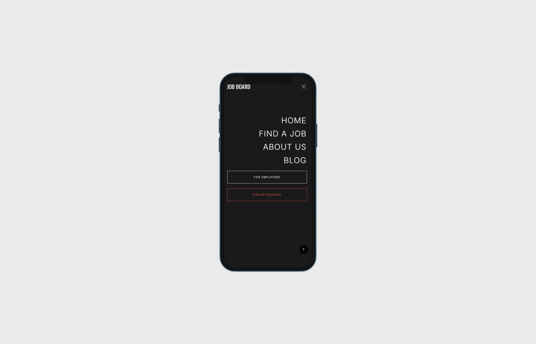
Remove padding between mobile menu CTA button and menu link text in Squarespace
By default, Squarespace’s mobile menu sometimes adds too much space between the call-to-action (CTA) button and the rest of your navigation links. This quick CSS fix cleans it up.
Step 1: Add the CSS
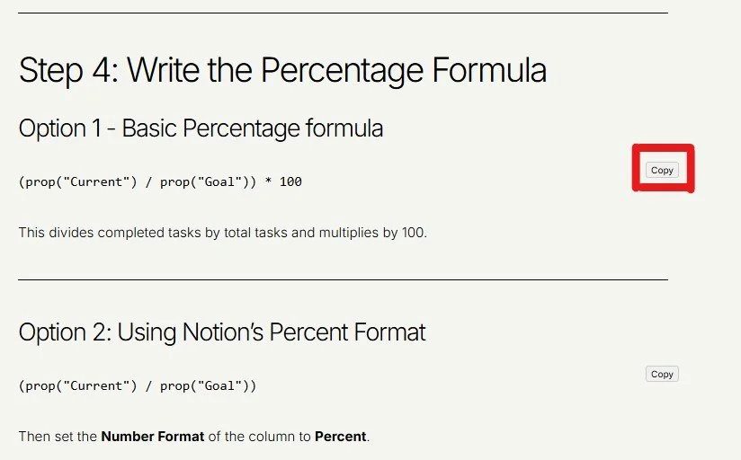
Go to Design → Custom CSS in Squarespace and paste the following:
.header-menu-nav-folder {
  min-height:20%;
}
.header-menu-nav-folder-content {
  margin-top: 20%;
}
Step 2: Save and Test
Refresh your site on mobile view. The unnecessary gap between your menu button and the link list should now be reduced, creating a tighter and more polished menu layout.
Pro Tip: Adjust the % values if you need finer control over the spacing for your specific website design needs.
Check out our library of code snippets and site enhancements.
RELATED ARTICLES


Found this tutorial helpful?